Animated Card Template:
Pink Kindergarten Graduation Friendship Card
Easy-to-Use Maker Function
Card Preview
You might also like


Card Design Description
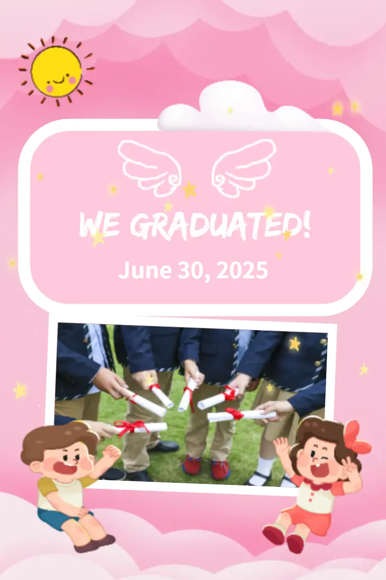
The "Pink Kindergarten Graduation Friendship Card", has a vibrant and whimsical design. The design conveys a sense of joy and accomplishment and marks the beginning of a new phase in life. It's an appropriate card for kindergarten graduation.
Color scheme
More Pink: Pink is the dominant color on the card and when we think of pink, we often conjure up feelings of coziness, caring / kindness, and playfulness. Pink is a nice consideration for a Kindergarten graduation as it elicits notions of youthfulness and coziness.
Soft Background: The gradations and pastel colors of the background add a softness that creates gentleness, friendliness and welcoming, yet still complements the overall design and isn't overpowering to the elements.
Contrasting Elements: The white and yellow text and decorative elements creates advisory contrast to the pink background color, this ensures that the message and details of the card can be clearly read and recognized.
Graphic Elements
Sun and Clouds: The use of a smiling sun and fluffy clouds lends to the whimical nature of the design. These elements not only add to the joyful theme but also indicate that the graduates are moving towards a bright and hopeful future.
Angel Wings: The angel wings add a nod to purity and beginnings. The wings are a common icon used in graduation themes, as they convey the representation of transition from one stage of life to the next.
Stars: The random scattering of stars adds a magical celebratory feeling to the design to illustrate how significant this event is in graduation terms.
Graduation Caps: The image of children with graduation caps relates to the overall theme of card. By nature, graduation caps represent the graduation achievement and represents the happiness of graduating.
Illustrated Children: The cartoonish children on the bottom of the card adds a playfulness and friendly element. The children are more likely to identify with the children in the card's images, which creates a personal attachment for their parents.
Typography: The font choice for "WE GRADUATED!" is bold and playful to reflect the excitement and pride of the occasion. For the date, the font is more subtle, and only serves as a hyperlink to the main theme.