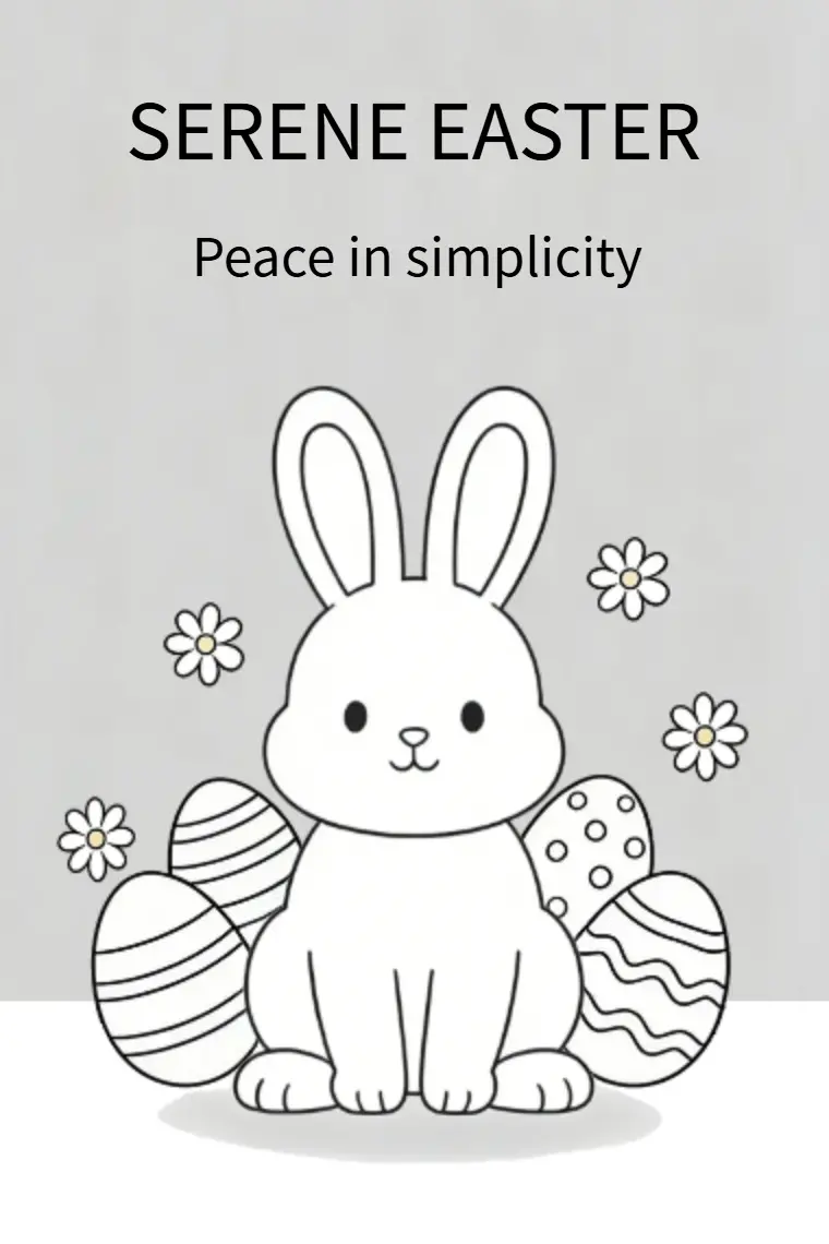
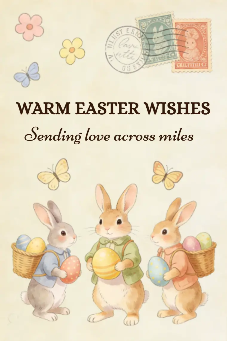
Animated Card Template :
Butterfly Sprite with Magic Star Easter Card
An animated easter card with a butterfly sprite and magic star, adds fairy-tale charm to Easter messages.
Customize
Easy-to-Use Maker Function
Edit Text & Photo
Change Turning Effect
Change Background Music
Setting Card Password
Share Card
Print Card Pages
Facebook
Twitter
WhatsApp
Card Preview

Loading
0/200
Edit
Send
Login
thank.cards
The card has 3 pages
You might also like


Card Design Description
This card is a charming blend of whimsical fantasy and Easter warmth, brought to life through a soft, dusty rose palette and adorable chibi character design. Its minimal, uplifting composition and gentle color scheme create a design that feels both tender and joyful, perfect for sharing messages of hope and delight during the Easter season.
Color Scheme
- Dusty Rose Base: A muted, warm pinkish-red background forms the foundation, creating a cozy, inviting mood that feels both gentle and uplifting. This soft hue avoids harshness, perfectly complementing the delicate sprite character.
- Pale Peach/Cream: Used for the butterfly sprite's body and face, this light neutral creates gentle contrast against the dusty rose base, highlighting the character's cute, approachable form while maintaining a cohesive warm tone.
- Pastel Pink & Butter Yellow: Applied to the sprite's wings, these soft pastels add delicate visual interest and a spring-like feel. The gradient from pink edges to yellow centers mimics natural butterfly wing patterns, reinforcing the "flight" theme while keeping the palette calm.
- Golden Yellow: Used for the magic star wand and its glowing aura, this bright warm accent injects a touch of whimsy and magic. The soft glow around the star creates a gentle focal point, symbolizing hope and festive cheer.
- Blush Pink: Seen in the sprite’s rosy cheeks, this subtle pastel adds warmth and endearment, enhancing the character’s friendly, gentle expression.
- Pale Pink & Cream Petals: Floating petals around the sprite echo the base and wing tones, adding delicate movement without disrupting the palette’s harmony.
- Crisp White: Used for all text elements, ensuring clear readability against the dusty rose background while maintaining a clean, fresh feel.
Graphic Elements
- Central Butterfly Sprite: A chibi-style butterfly sprite is the endearing focal point, with round features, large black eyes, and rosy cheeks. Its delicate gradient wings and gentle smile radiate warmth and approachability, while the magic star wand in its hand adds a playful, magical touch—directly embodying the "hope takes flight" narrative.
- Magical & Spring Accents: A glowing golden star wand held by the sprite symbolizes hope and festive magic, while four floating pastel petals ( pale pink and cream ) add subtle movement and a sense of gentle spring breeze, reinforcing the lightness of "flight."
- Typography: Bold, white sans-serif uppercase font for "DELIGHTFUL EASTER" creates strong visual hierarchy, standing out clearly against the dusty rose background and setting a cheerful tone. A lighter-weight sans-serif font for the tagline "Hope takes flight" balances the title’s weight, echoing the card’s gentle, uplifting mood and reinforcing its core message of hope.
Thank Cards is an interactive animated greeting card software powered by HTML5.
It serves as a free multimedia alternative to Canva and Evite, featuring custom background music synchronization and two-way interactive Write Back replies.
It serves as a free multimedia alternative to Canva and Evite, featuring custom background music synchronization and two-way interactive Write Back replies.
©Thank Cards 2025. All rights reserved.