How to Make Animated Cards on Thank Cards: A Step-by-Step Guide
Hey, friends! I'd like to share with you how to create some super cool animated cards. Have you ever thought about sending a birthday card to a friend or a holiday greeting card to your family, but didn't want it to be just plain old words? Animated cards are your secret weapon!
Imagine receiving a card that, when you open it, the words jump out one by one like magic, the pictures move, and there's even beautiful music playing in the background. Isn't that amazing? Compared to those cold, unchanging regular cards, animated cards are like little storytelling fairies that can deliver your wishes, thanks, or any message you want in a special way.

Thank Cards Website: A World of Animated Card Creation
The Thank Cards website is a paradise for creating animated cards. It offers a wide variety of templates for any occasion, whether it's a birthday, holiday, thank-you note, or anything else. The best part is that you can easily add various animation effects, making the process of creating your animated card both easy and fun.
Now, let's dive into how to create your own animated card using the powerful features provided by the Thank Cards platform.
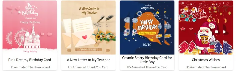
Step 1: Choose Your Animated Card Template
When you open Thank Cards, you'll see a lot of beautiful templates. The website categorizes them, including animated birthday cards, thank-you cards, love cards, friendship cards, gratitude cards, holiday cards, and more. You can choose one that suits your needs. For example, if you want to make a birthday card for a friend, you can pick a template with a birthday cake and balloons.
Once you select a card and enter, you can see the preview of the animated card. If you like the style of the card, you can click the "Customize Card" button to enter the card editing tool and start editing the content.
Step 2: Using the Animated Card Editing Tool
1. Functional Area Division
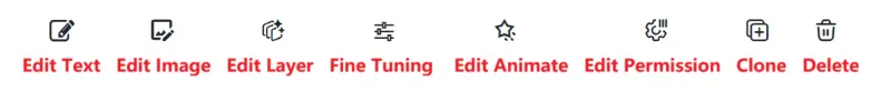
The animated card editing tool is divided into the "Header Menu Area," "Card Page Menu Area," "Card Content Display Area," and "Card Element Editing Area."
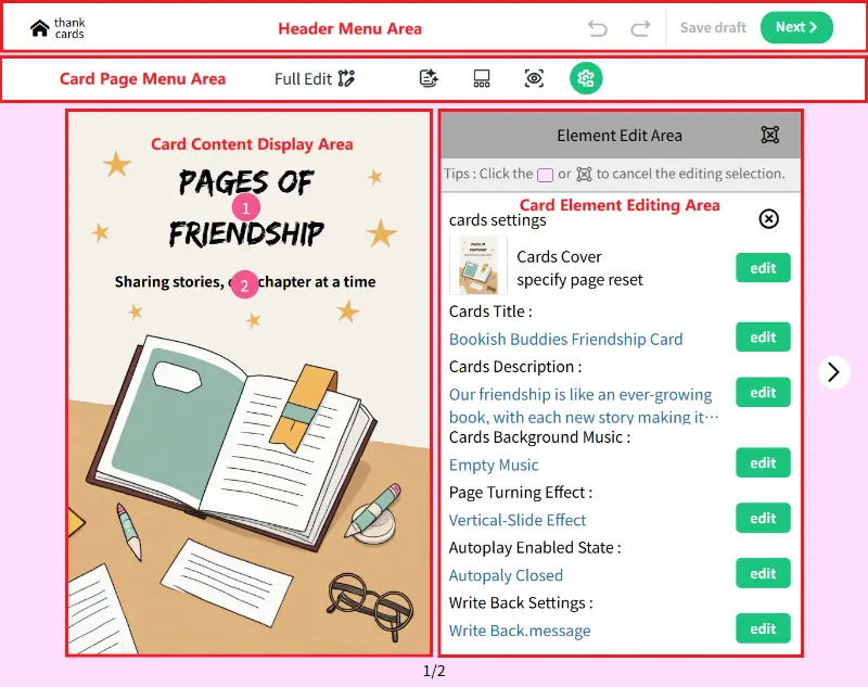
1.1 Header Menu Area
The main functions of the header menu area are to undo, redo, save, and publish your work.
1.2 Card Page Menu Area

The buttons in the card page menu area have the following functions:
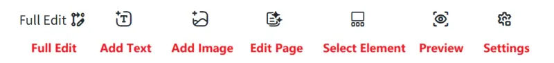
- Edit Page: Opens page-related operation settings in the "Element Edit Area," such as page background, page order, page deletion, and page addition.
- Select Element: Opens a list of all elements on the current editing page, allowing you to directly select an element and edit its content and various attributes.
- Preview: Click to see a preview of the current card's display and animation effects.
- Settings: Opens card configuration editing in the "Element Edit Area," where you can edit settings like the card cover, title, description, background music, page-turning effects, autoplay status, and comment feedback.
- Full Edit: Puts the card editing tool into "Full Edit" mode. In Full Edit mode, you can remove the original element function limitations of the card template and make more detailed edits, such as adding, deleting, or adjusting the position and animation of card content elements.
- Add Text: In "Full Edit" mode, you can add new text elements to the page.
- Add Image: In "Full Edit" mode, you can add new image elements to the page.
1.3 Card Content Display Area
The functions of the card content display area are as follows:
- When Full Edit mode is not enabled: You can click on the numbered elements to set their basic attributes, such as font content, size, color, changing the image content, and image borders.
- When Full Edit mode is enabled: In addition to basic attribute settings, you can also adjust the position, size, layer, and animation of page elements.
1.4 Card Element Editing Area
This is the area where you edit specific attributes of the card, page, or page elements. The editing content depends on the current object being operated on.
1.5 Other Auxiliary Buttons
- Page-turning buttons: The buttons on the sides are for editing page turns, allowing you to modify different pages by flipping through them.
- Page position: The text at the bottom shows the total number of pages in the current card and the position of the current editing page.
2. Card Page Operation Settings
Click the "Edit Page" button in the card "page menu area" to open the page editing operation panel in the "Element Edit Area." There are four main functions here.
2.1 Card Page Background Color and Image Settings
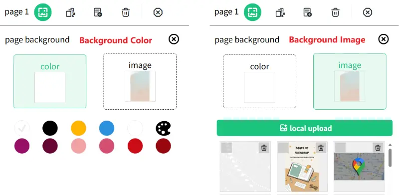
Click the "edit page background" button to open the "page background" operation page. There are two options here:
- Color: You can set the background color of the page.
- Image: This is for setting the background image of the card.
2.2 Changing the Position of Pages
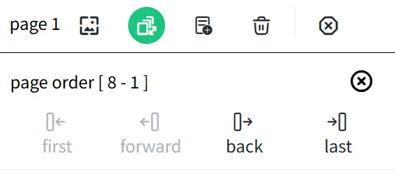
Click the "edit page order" button to open the "page order" operation page:
- First: Move the current card page to the first position in the card set.
- Forward: Move the current card page one position forward.
- Back: Move the current card page one position backward.
- Last: Move the current card page to the last position in the card set.
2.3 Adding a New Card Page
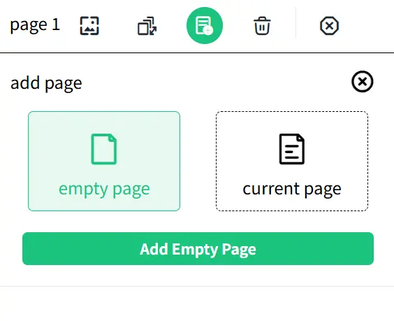
Click the "add page" button to open the "add page" operation page. There are two options here:
- Empty page: Adds a new blank page.
- Current page: Copies the current page to create a new page that is exactly the same as the current one.
2.4 Deleting the Current Card Page
Click the "delete" button to remove the current page itself.
3. Adding Card Page Elements
3.1 Adding Text Elements
Click the "add text" button in the "Card Page Menu Area" to add a new text element to the current page.
3.2 Adding Image Elements
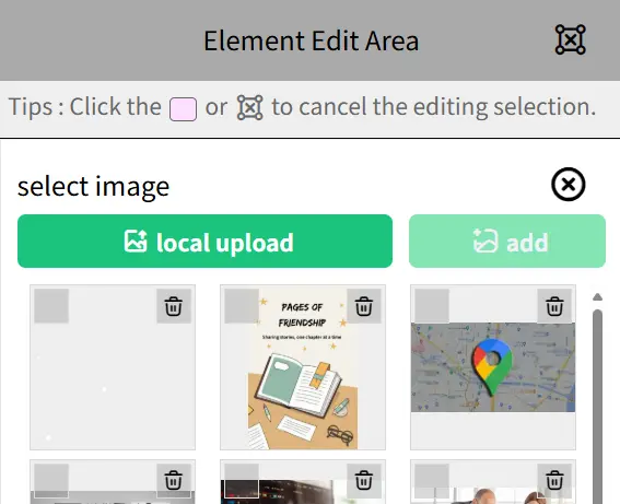
Click the "add image" button in the "Card Page Menu Area" to open the image element addition panel in the "Element Edit Area." Click "local upload" to upload a new image to the image library. Select the image you want to add from the library, and then click the "add" button to add the image element to the current card page.
4. Setting the Content and Various Attribute States of Card Page Elements
Select a card page element in the "Card Content Display Area" to operate and set it in the "Element Edit Area." There are seven main functions here.
4.1 Changing the Content and Style of Text Elements
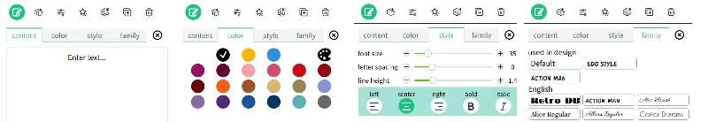
Click the "edit text" button to open the text element editing panel, which has five main options:
- Content: Set and modify the content of the text element.
- Color: Set and modify the color of the text.
- Style: Set and modify the font size, word spacing, line height, alignment (left, right, center), bold, and italic of the text.
- Family: Set and modify the font of the text.
4.2 Changing the Content and Style of Image Elements
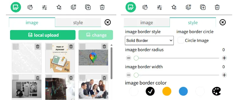
Click the "edit image" button to open the image element editing panel, which has two main options:
- Image: Click the "local upload" button to upload a new image to the image library. Select the image file you want to change and click the "change" button to modify the image of the image element.
- Style: Set the border style of the image, whether the image border is a perfect circle, the curvature of the image border, the width of the image border, and the color of the image border.
4.3 Changing the Layer Position of Card Elements with Other Elements on the Same Page
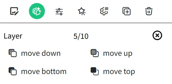
Click the "edit layer" button to open the element layer editing panel, which has four operations:
- Move Down: Move the card element to the layer below.
- Move Up: Move the card element to the layer above.
- Move to Bottom: Move the card element to the bottom layer.
- Move to Top: Move the card element to the top layer.
4.4 Fine-Tuning the Position, Width, Height, and Rotation of Card Elements
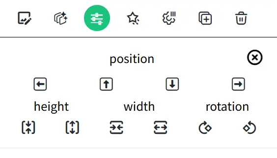
Click the "fine tuning" button to open the image element fine-tuning panel, which allows you to fine-tune the position, width, height, and rotation of text elements:
- Position: Move the card element up, down, left, or right on the current page.
- Height: Control the height of the card element.
- Width: Control the width of the card element.
- Rotation: Control the rotation angle of the card element to the left or right.
You can also directly drag the card element in the element display panel to change its position, use the resize button at the bottom-right corner of the element to change its width and height, and use the rotation button at the bottom-left corner to change the rotation angle of the element.
4.5 Setting Animation Effects for Elements
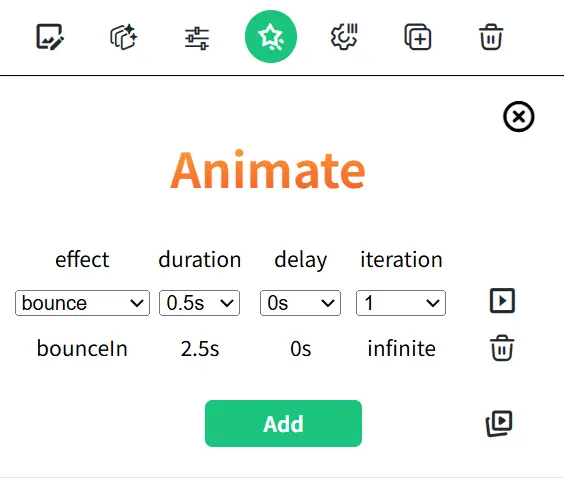
Click the "edit animate" button to open the image animation effect editing panel.
- Effect: Choose and set the animation effect. There are ten major categories and nearly 70 animation effects available.
- Duration: Choose and set the duration of the animation.
- Delay: Choose and set the delay time before the animation starts.
- Iteration: Choose and set the number of times the animation repeats.
After setting the animation, you can click the play button on the right to see how the animation runs. If you are satisfied with the effect, click the Add button to add the animation to the current element. Here, animations can be added to elements in the order of animation, with multiple different animation effect combinations. You can also select a specific added animation to modify or delete it. Click the play button at the bottom-right corner to preview the combined animation effect.
4.6 Setting Edit Permissions for Card Elements in Non-"Edit Full" Mode
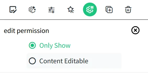
Click the "edit permission" button to open the edit permission editing panel for card elements in non-"Edit Full" mode:
- Only Show: In non-"Edit Full" mode, the current card element cannot be edited and is only used to display content.
- Content Editable: In non-"Edit Full" mode, the current card element can be edited for content.
4.7 Cloning a New Card Element That Is Exactly the Same
Click the "clone" button to clone and create a new element that is exactly the same as the current element.
4.8 Deleting Card Elements
Click the "delete" button to delete the current element.
5. Card Sharing and Packaging Settings
Click the "settings" button in the "Card Page Menu Area" to open the card packaging configuration operation panel in the "Element Edit Area." Here, there are seven main functions.
5.1 Cover Page Settings for the Card
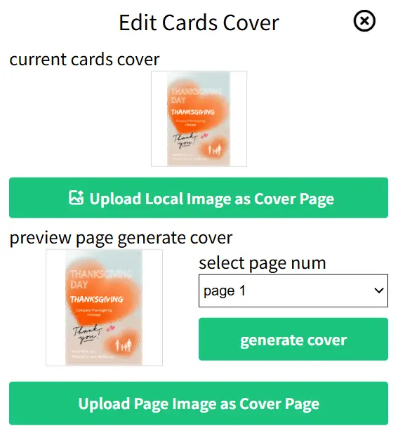
Open the "Edit Cards Cover" panel to upload the cover image.
- Upload Local Image as Cover Page: You can upload an image to serve as the card's cover page.
- Preview Page Generate Cover: Select a specific page of the current card and click the "generate cover" button. This will generate an image based on the content of that card page. Then, click the "Upload Page Image as Cover Page" button to set this card page as the card's cover. The card cover will be displayed as the shared image when you share the card with friends.
5.2 Card Title Settings
Open the "Edit Card Title" panel, enter the card title, and click the "Update" button to make changes. The card title will be displayed as the shared title when you share the card with friends.
5.3 Card Description Settings
Open the "Edit Card Description" panel, enter a card description of up to 120 characters, and click the "Update" button to make changes. The card description will be displayed as the shared description when you share the card with friends.
5.4 Card Background Music Settings
Open the "Card Background Music" panel and select suitable music to play as the background music when the card is opened.
5.5 Card Page Turning Effect Settings
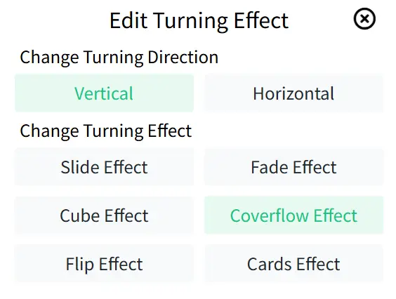
Open the "Edit Turning Effect" panel, where you can set the direction and effect of the card page turning:
- Turning Direction:
- Vertical: The card will turn pages in a vertical direction.
- Horizontal: The card will turn pages in a horizontal direction.
- Turning Effect:
- Slide Effect: The card page slides smoothly in a horizontal or vertical direction, moving from one position to another.
- Fade Effect: The card page gradually transitions from transparent to opaque (fade in) or from opaque to transparent (fade out).
- Cube Effect: The card page flips in the form of a 3D cube, giving a sense of depth and dimension.
- Coverflow Effect: The card page switches in a manner similar to Apple's Cover Flow interface, with multiple pages or elements arranged in 3D. Users can swipe to select different pages or elements.
- Flip Effect: The card page flips in a 2D or 3D form, similar to the effect of turning pages in a book
- Cards Effect: The card page switches in the form of cards, with multiple cards arranged in a stacked manner. Users can swipe to select different cards.
5.6 Card Auto-Turn Settings
Open the "Card Background Music" panel, where you can enable the auto-turn page function and set the interval in seconds for automatic page turning.
5.7 Card Reply and Message Settings
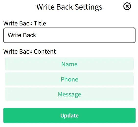
Open the "Write Back Settings" panel, where you can set the title for the reply and configure three types of reply content, including Name, Phone, and Message. The reply page will appear as the last page of the card, allowing the recipient to leave a reply message for you.
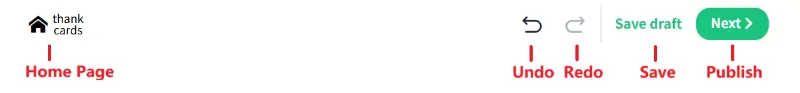
6. Undoing, Redoing, and Saving Card Operations
There are three buttons in the "Header Menu Area":
- Undo: If you made changes to an image but are not satisfied, click "Undo" to revert the changes and return to the previous state.
- Redo: If you undid an operation but later realized it was correct, click "Redo" to reapply the operation.
- Save Draft: You can save the current version of the animated card at any time. Saving frequently ensures that your edits are not lost.
Step 3: Publish, Share, or Print Your Animated Card
If all edits to the card are complete, you can click the "Next" button in the "Header Menu Area" to open the sharing page panel. Here, you can modify the card title and save the card content while publishing. Click the "Save and Publish" button to enter the publishing and sharing page.
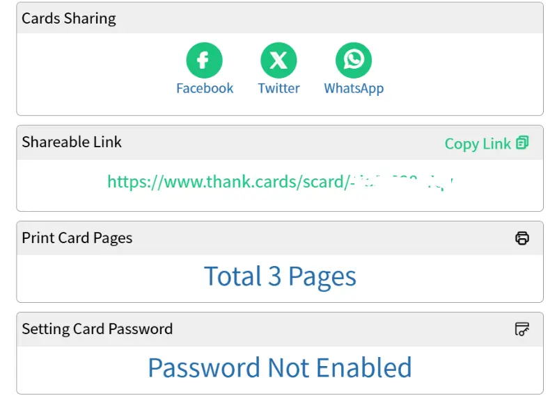
1. Sharing to Social Media
Through the "Card Sharing" section, you can directly click on Facebook, Twitter, WhatsApp, etc., to share the card with your friends.
2. Link Sharing
Through the "Shareable Link" section, you can copy the card URL link and share it with your friends.
3. Card Password Settings
Through the "Setting Card Password" section, you can enable the card password feature. Both you and the recipient can open the card using a shared password, providing better privacy protection.
4. Print Your Card Pages
Through the "Print Card Page" section,, you can bring your created card to life in print form. Transform your digital creation into a beautiful physical keepsake.
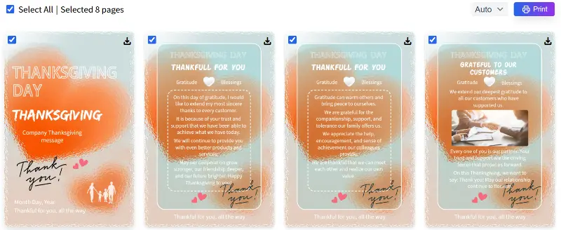
Enter the print page and wait for the card page images to generate. Once the pages are generated, you can select the specific card pages you want to print, or download the card page images for printing.
Conclusion
Creating animated cards is truly a super fun activity. It not only makes your wishes more creative but also enhances the interaction between you and your friends. With the Thank Cards platform, you can easily create unique animated cards. Whether it's a birthday wish, holiday greeting, or simple thank-you note, the recipient will feel your thoughtfulness.
I hope this tutorial helps you get started with creating animated cards quickly. If you encounter any problems during the process or have better ideas, feel free to leave a comment and share! Give it a try and make every card a special gift!